Tag: health

A greener buzz?

When I was young, electric toothbrushes were something we laughed at. Imagine being too lazy even to wiggle a toothbrush up and down without powered assistance! But as an adult, I discovered that most dentists now thought they were rather good, and recommended them.

Electric toothbrushes did a better job of cleaning in general, they said, and the smaller head would get into places that manual toothbrushes wouldn't reach. Perhaps, I thought, gadget enthusiasts like me shouldn't feel embarrassed about actually trying one. I wouldn't have to admit it to anyone..

"There's a huge range", I remember my dentist telling me. "Don't go for the ones with silly prices and dozens of bells and whistles. 40 quid or so is probably about right."

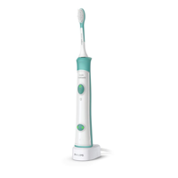
So, for a while, that's the kind of thing I used. They're probably about 50 or 60 quid now. They have a rechargeable battery, sit on a base that charges it inductively, and have a simple timer to help you spend the right amount of time brushing. You know the kind of thing.

But one thing about them always bugged me: the batteries were rubbish.

Long before the motor or the casing gave up the ghost, the built-in, non-replaceable battery would die, or stop holding enough charge even for one brush, and the whole thing would have to go in the bin. Then I'd buy a new one, which came with its own charging base, so the previous base, and cable, and plug - they all went in the bin too.

This was not very good for my wallet, and a great deal worse for the environment.

So I expect you will laugh, gentle reader, when I tell you that what changed my purchasing habits was brushing my dog's teeth. Yes, our spaniel gets her teeth brushed every night, and she enjoys her chicken-flavoured toothpaste, but won't tolerate brushing for very long, so we got her an electric brush, too, to make maximum use of the time available!

We weren't going to buy her any big 60-quid devices, though, so we looked online for ones designed for children, and Tilly now has a children's Oral-B toothbrush. It's pink and blue and I think it has fairies or princesses or unicorns on it, but she doesn't seem to mind.

And as we used this, a few things struck me:

  • The motor mechanism looked as if it was just the same as my own expensive one.
  • It took the same brush heads.
  • It used replaceable AA batteries. I had plenty of rechargeable Eneloop AAs. (Take a look at my post from about 10 years ago to see why I like those. I'm still using much the same system now, and most of the batteries I had back then are still in use.)
  • This also meant I didn't need to have charging bases and cables in the bathroom.
  • It didn't have a timer. But I could count elephants.
  • It cost about one quarter of the price.

And so I now have, and can recommend, a very basic Oral-B battery-powered toothbrush. Currently £14.99 on Amazon. It has lasted longer than my previous expensive ones, and the two AA batteries hold their charge way longer than the built-in ones ever did. Occasionally, I take them out to charge and swap in some fully-charged ones from my drawer -- that's why I love Eneloops and similar rechargables: they stay fully-charged in the drawer -- and freshly-charged batteries seem to last for weeks.

Since I got this, some years back, nothing has gone in the bin except the occasional elderly brush head, and when it does eventually die, it'll be far less wasteful than something that takes its batteries and charging base to the grave with it.

Oh, and best of all? Mine doesn't have any princesses or unicorns on it. Tilly is still bitter about that.

Drug-inspired Lyrics

I know that many popular lyrics have been inspired by the use of drugs, so I thought I'd try my hand at it.  This was written recently while packing for a journey.  Or, perhaps, a trip.  My brother, a highly-qualified medic, was on hand to help. With the lyrics, at least.

John and Yoko are busy composing the melody, but in the meantime you can sing it to the tune of It's a long way to Tipperary.

I need one more Atorvastatin
  I've got one more to go.
I need one more Atorvastatin
  It's the neatest pill I know.
Goodbye to cholesterol
  Farewell, LDL!
I need just one more Atorvastatin
  And all will be well!

I expect it to become a hit amongst other middle-aged music afficionados.

Fixing the NHS problem

My parents live about 13 minutes' drive from the nearest hospital. There's also a more substantial one 20 mins away. Over the last few years, they have on several occasions needed to call an ambulance after falls and other serious issues, and the waiting time is always measured in hours; on a couple of occasions, more than eight hours.

This shocks me, but it shocks my American wife even more. When they had to call an ambulance for her mother in Michigan -- a fairly regular occurrence in her later life -- they would worry that something was wrong if it hadn't arrived in twenty minutes, because normally it was there in about ten. For all the outrageous costs and several other failings of the American health system, there are some things it does do rather well.

The simplistic public response to the NHS problem is to blame under-funding. "It's because of Tory cuts!" Here's a graph that was popular on Twitter last year, for example, and looks pretty damning:

But let's be clear about what this graph shows: this is expenditure growth, above the rate of inflation. In other words, since its foundation, every government has given the NHS significantly more money in real terms every year. Some have increased it faster than others, but there have never been any 'cuts', from Tories or anybody else. So, while more money is desirable, that's not the primary problem.

(As an aside, we all love the story of Captain Tom Moore who so caught the public imagination by his sponsored walks around his garden between his 99th and 100th birthday that he raised a whopping £33M for the NHS, earning him a knighthood, an honorary doctorate and an RAF flypast on his 100th birthday. It was a great feel-good story during the pandemic, and I don't want to take anything away from his achievement by pointing out that he, and all his millions of sponsors, funded the NHS for a total of about an hour and a half. The world would be a much better place with more Captain Toms in it, but a whole battalion of Toms are unlikely to make a significant difference to the NHS.)

Now, I've written before about some NHS experiences that have convinced me that serious administrative incompetence is the source of many of its issues. And, to the extent that proper funding is also needed, I pointed out, it simply requires us all to vote in a government that is going to charge us about £1000 more per family member per year, and earmark that exclusively for the NHS. The UK public has only very occasionally been given the option to do something like that, even on a more modest scale, and they have never voted for it.

So I was intrigued by John Burn Murdoch's analysis in yesterday's FT. (The page itself is probably behind a subscriber paywall.) He provides the usual worrying statistics about A&E and ambulance waiting times, but points out:

While the pandemic has undoubtedly created a shock in the UK's publicly funded health system, the NHS's underlying issues are chronic. Waiting lists for elective treatment have been lengthening for 10 years, and the target of keeping 95 per cent of A&E waits under 4 hours missed for just as long.

...

It would be easy to blame underfunding, but in 2019 the UK spent just over 10 per cent of GDP on healthcare, placing it among other wealthy western European countries. The trend over the past two decades has also aligned with comparable nations, according to the OECD.

The key problems, he suggests, are also not simply with staff shortages:

While the number of fully qualified permanent GPs in England has fallen by 8 per cent since 2009, that of hospital doctors has grown by a third, outpacing the growth of the elderly population that accounts for an outsized portion of hospital demand. Nurse numbers continue to grow despite more departures this year.

In other words,

... ever growing resources are being used to treat ever more sick people, but ever fewer are being used to prevent them from getting sick in the first place.

The UK ranks among the highest for admissions to hospital for some conditions which would, in other countries, be largely treated within primary healthcare. (I am reminded of my wife's surprise that GP practices in the UK don't generally have X-Ray machines: you have to go to hospital for a check on a minor fracture!)

Anyway, the first part of his proposed solution is that we need to rethink the balance between primary care and hospital care; this is more of an issue than overall funding levels.

And the second is that it's easy to blame staff shortages, but studies have shown that A&E delays, for example, are primarily about physical capacity -- especially bed capacity -- in the rest of the hospital, and are not significantly affected by staffing levels.

In summary, he says,

Much like any chronic illness, the NHS's afflictions will not be cured with a sticking plaster. The road to recovery is paved with long-term investment to upgrade the physical capacity of the system, and to gradually shift the balance from treatment in hospitals to primary and preventive medicine.

A nicely-written article, and one of the many reasons I would pay for an FT subscription if the university wasn't kind enough to do so for me.

Update, about six months later: There's a very interesting page at the BMA providing an overview of current health spending in the UK and how it compares to other countries, and to the past history of the NHS.

Strength Gel

Samson had his long hair, Asterix and Obelix their magic potion, but for today's man-about-town wishing to increase his muscular prowess, I discover that this small and convenient tube of 'Strength Gel' is readily available from most pharmacies!

It's surprising, because Anbesol is a name I knew from my youth. A treatment for mouth ulcers and similar dental complaints, it was packaged as a very small vial of liquid. Well, the strength gel, it turns out, can also be used for this antiseptic and anaesthetic purpose, and, indeed, has such a powerful calming and numbing effect that I'm surprised Simon and Garfunkel didn't write a song about it.

As to why it might be Adult strength gel, though, I can only leave to your imagination. The packaging is very uninformative about any use in more intimate situations, but I would suggest any experimental applications be done very, very cautiously.

Covid: Destiny and Density?

It always seemed probable to me that Covid infection rates would be closely related to population density. When you walk down the street, how many people do you pass? Are you in a house surrounded by fields or in a tall vertical apartment block where you share an entrance and staircase with many other households? How big are the schools? And so on.

At a country level, though, this is difficult to test. I plotted the very latest total number of Covid-related deaths per million population against the population density per sq. km. for some countries similar to my own (UK), and it didn't show a clear correlation.

Sources: Statista and Wikipedia.

(As usual, whatever they're doing in the Netherlands is good. Why do the Netherlands keep doing that with everything? Please stop. It's very annoying to the rest of us.)

Depending on your political persuasions, or whether you're a glass-half-full or a glass-half-empty kind of person, you could interpret this in various ways!

My own view (at present), for what it's worth, is that our government and senior civil servants didn't put enough emphasis on lockdowns in the early months, and that cost us a lot. But they did put much more energy and resources than most other countries into securing vaccines on a huge scale, very early, and we're now reaping the benefits. So depending on the time period you examine over the last year, the picture relative to other countries can look very different. (The sadly-missed Hans Rosling would have had some nice animations, no doubt!)

At present, if you take the long view of total Covid deaths per capita, we're a bit higher than the average for similar countries, but our rate of new deaths is lower than almost anyone's, so we will probably look better over time. So it could have been much better, and it also could have been much worse.

Anyway, back to population density. The problem is that density is far from evenly distributed. If I plot England on the map, as distinct from the UK as a whole, it appears in a very different place: the top-right:

England is up there with the most-afflicted other countries from my list -- Italy and Belgium -- but it does have a notably higher population density than any of them.

Anyway, the results of my quick graphs are that I was probably wrong: it's not clear that population density is a useful metric, at least when done at this scale.

What we really need, if we want to compare the situation in different countries, I think, is statistics about both Covid cases and population density across Europe on a 20km grid. Then we could compare them more usefully, and one day, perhaps, we'll know whether I'm wrong in the details too, or only on the larger scale!

Keeping things in proportion

Yesterday, in response to another thread about the AstraZeneca vaccine concerns, I tweeted,

"I hear there's also a risk of having a car accident while driving to or from your AZ vaccination! Why is this not being revealed to the public?"

Which got some cheery replies, like,

"You could be run over walking from your car too, these car parks are dangerous places!"

And Clive Brown responded with a quick back-of-the-envelope calculation which showed that, yes, indeed, if you drove 6 miles for your vaccine, an accident was more likely than a blood clot.

Getting mine tomorrow, if I survive the journey...

Mid-life Covid crisis?

I'm a middle-aged computer geek, but my iPhone is too old to run the NHS Track & Trace app. I think this is a limitation of the Bluetooth hardware, but my phone also can't run a recent-enough version of the operating system.

This isn't a criticism of the app; you need the right hardware to do something like this. But it makes me wonder about the proportion of the population that will actually be able to run it. Perhaps middle-aged computer geeks like me are actually the most likely to have elderly phones? I wonder whether anyone has done a graphic, plotting the age of users against the age of their smartphones? Probably a kind of 3D histogram?

On the one hand, younger users are probably more likely to be swayed by a desire for the latest gadget and by competition with their peers. But older users are, I guess, more likely to have the disposable income to upgrade. Mmm.

And now, of course, we have some interesting extra dimensions. The effectiveness of the app is highly dependent on its market penetration, and that penetration in different age-groups is going to be constrained by this distribution.

Is it particularly important that older people, who are more vulnerable to Covid, have this app? Well, probably not directly, because the app doesn't protect you; it protects those who may come into contact with you in the future. On the other hand, perhaps older people are more likely to be in contact with other older people in the future, so it is important that they know when they shouldn't be socialising.

There are lots of lovely opportunities for research, here, and for inventive data visualisation. Anyone got any funding available?

One thing is clear, though. The more of a social animal you are, of whatever age group, the more important it is that you run this. (That's a serious point, so no snarky comments, please, about whether middle-aged computer geeks often fall into that category.)

Now, here's a last thought. I have been considering that it may finally be approaching the time when I do upgrade my phone. But I'm likely to wait until Apple announces their next models, presumably sometime between now and Christmas. (This isn't because I want the latest one, necessarily, but because the current top model will probably be demoted to a cheaper price bracket when its position is usurped.) I imagine many others may be in the same position, and large numbers of us will become track-and-traceable only after that point.

So...

Given that this same technology is being used around the world, how many lives might be dependent on the timing of the next Apple and Samsung product announcements?

Passing the buck the right distance

Here's something I don't quite understand. It's the responsibility of the National Health Service to provide a health service to the nation. Presumably, things like the sourcing of PPE, the purchasing of ventilators, the arranging of tests, and even, to some degree, the deployment of diagnostic phone apps, is their area of expertise. It's what they do.

Now, these are not normal times, of course, and there's always the complaint about insufficient funding, past and present. But I doubt that's valid now since, presumably, the government would now happily write bigger cheques for the provision of these things. So I'm slightly intrigued that the NHS is complaining that the government isn't providing them, rather than the other way around! Intrigued, though not surprised.

Now, clearly I'm missing something, because everybody else seems to think the government is responsible for medical supplies too. It could be that PPE supplies are primarily delayed because of something like customs and excise rules, in which case, yes, clearly the government is culpable.

Or it could be that the NHS is saying, in effect, "you underfunded us for years, so now that we have a big problem, it's actually your problem! So there!" Government departments are presumed to be more competent at logistics than the NHS, when both are given sufficient funding, so we'd better hand it over to you, even though we're the ones with the contacts and the contracts.

But I think it's probably that the boundary between the government and public services is a sufficiently blurred one that, if you are senior enough in the NHS, your job title begins with 'Minister' or 'Secretary of State'. This is very convenient, because it means that anyone who wants to complain about how things are going -- to increase the ad sales in their newspaper, for example -- can make it a political complaint, which is acceptable and even popular, rather than be seen in any way to be criticising the NHS, which would be suicidal.

So that raises the interesting question of where the boundary of blame can sensibly be drawn, while maintaining political correctness. Everyone is allowed to blame the Prime Minister and nobody is allowed to blame a nurse; so where does, and where should, the buck stop between the two?

To the extent that some people believe the UK Covid response has been badly handled, how do we hold the correct public institutions, or individuals, accountable when it comes to be reviewed? When the next health crisis comes along, should we expect the health service to handle the provision of health-related services, or the political party currently in power at that time?

I don't know anything about the management hierarchy involved, but I'm guessing that, as you ascend it, you reach a point where the payslips no longer have an NHS logo on them; where NHS administrators become civil servants. A bit higher, civil servants become short-term political appointees. Are either of these the correct point for rational people to start assigning blame in the case of unforeseen medical emergencies? Should it be higher or lower?

More good analysis tools from the FT

I've talked before about some of the nice statistics the Financial Times is gathering about the epidemic, and the clear dispassionate way it's presenting them.

Their latest tool gets more interactive, and lets you compare, in various ways, how your country is doing against others. I like three things about this in particular.

  • Firstly, you can choose a linear scale. Log scales are handy for scientific visualisation but are harder to grasp intuitively.

  • Secondly, you can get the numbers per capita, which I think is much more useful than absolute figures, though it doesn't of course take into account population density, which is also important.

  • Thirdly, when you get the analysis in a form you like, you can capture that in the URL and send it to others: the inability to do that is a common problem in today's over-Javascripty pages!

So you can do your own investigation and see that by some measures, your country is doing fairly well (cumulative cases compared to Spain):

And by other measures not so well (daily new cases compared to France):

You don't have to switch countries to get different viewpoints, though. Suppose you wanted to make the case that the UK and France were pretty much neck-and-neck, you'd plot the absolute cumulative deaths on a log scale:

(Neither of these capture the fact that France has less than half the population density of the UK, but they're still useful illustrations.)


Here's another example:

Let's display the same data about the UK and Italy in two different ways.

Do you want to make the UK (or its government, healthcare system, population, whatever) look reasonably good? Plot the cumulative cases.

Does your editorial policy or personal preference dictate that you want to make the UK government, healthcare system or population look bad? Then plot the same data as a daily rate (roughly the gradient of the above graph).

That's the same data over the same period on the same kind of axes.

All of which illustrates why it's good to have a tool where you can explore the data yourself. As long as you really do explore it and don't just stop when you get the conclusion you want!

In the above examples, the images are links to larger versions: the links in the text take to the FT site where you can experiment to your heart's content.